- Original release
- Previous episode S01E07 - The debate drinking game (with data science!)
- Number S01E08
-
External links
YouTube page
-
Last update
24 juillet 2023 - 11:48
on 11 databases
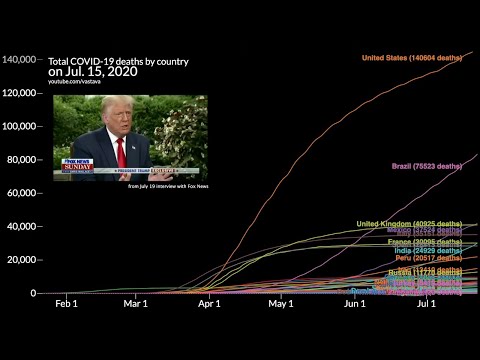
Timeline of COVID-19 deaths by country (and Trump's comments on the virus)
An animated line chart race of coronavirus deaths by country from January until now, along with a timeline of Trump's responses and quotes regarding COVID-19.
This video was heavily inspired by carykh and Lessons From the Data. Check out their content!
carykh's Wikipedia rewind: https://www.youtube.com/watch?v=PranVQik0yg
LFTD's UK coronavirus deaths timeline: https://www.youtube.com/watch?v=O0-pzyv84ag
Follow me on twitter! https://twitter.com/vastava_
Data scraped from worldometers: https://www.youtube.com/redirect?q=https%3A%2F%2Fwww.worldometers.info%2Fcoronavirus%2F&redir_token=QUFFLUhqa3cyLUowVVlGdHgxbFEzU2Z1SU52WDg3eExIUXxBQ3Jtc0tuamF1b0NObkZqbnkwaGZkX0dtUXR2YzdwdEFWakFhMFpoMUl3R0c0all1NElHLTNONGs2OE1peXlsSHJnWF9uNnF2NlJKUlZ0YVJmY21PYVNKa0xtNlM3Tmc3bGRpX3pXZHpXdUljcHVkY2ZCbV95RQ%3D%3D&v=ujQ9Gy0LWiQ&event=video_description
Chart made using d3.js.
Music: Skyline by Juju Mas
Other videos you might enjoy:
The debate drinking game (with data science!): https://www.youtube.com/watch?v=75AQqX8W0Hc
Most viewed Wikipedia article by day: https://www.youtube.com/watch?v=39nV7f3HZg0
#vastava #datavisualization #covid19