- Originele uitgave
- Vorige aflevering S01E17 - Did 2020 break Rotten Tomatoes? | data analysis
- Aantal S01E18
-
Externe links
YouTube-bestand
-
Laatste update
24 juillet 2023 - 11:48
op 11 databases
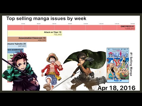
Best selling manga issues by week (2012-2021) | bar chart race
Animated data visualization of the best-selling manga issues by week. Data was scraped from Oricon's weekly top 10 ranking of manga sales, and was auto-translated using Google Translate's API. Please forgive any translation errors! Chart was built in d3.js ☺
Link to code/tutorial: coming soon!
Follow me on twitter! https://twitter.com/vastava_
0:00 Intro
0:10 2012-14
1:10 2015
3:53 2016
6:36 2017
8:48 2018
9:34 2019
11:51 2020
14:11 2021
14:40 Outro
Other videos you might enjoy:
2020 Rewind! Wikipedia's most viewed articles, by day (July 2020 - Jan 2021) https://www.youtube.com/watch?v=XP0Xft-MNqs
Is Sonic fan art disturbing? *data analysis* https://www.youtube.com/watch?v=x_XR-K1cL7w
I trained an AI to tell me CORPSE's music genre | data science https://www.youtube.com/watch?v=VTU6Jla70VY
Why is Attack on Titan SO Popular? | data analysis https://www.youtube.com/watch?v=4jXjDofVBoY
Music used:
KOMODOI - Cloudy
BODYSURFER - Call Your Grandma
Zorozo - Ghost of the Samurai
Harris Heller - Spring Rollin’
#vastava #manga #dataviz